Part 10: Intro to Visualization
Basic Line Plot
Bar Charts
# Bar charts are great for comparing categories
departments = ['Sales', 'Engineering', 'Marketing', 'HR']
employees = [25, 40, 15, 8]

plt.figure(figsize=(10, 6))
plt.bar(departments, employees, color=['skyblue', 'lightgreen', 'coral', 'gold'])
plt.title('Employees by Department')
plt.xlabel('Department')
plt.ylabel('Number of Employees')
plt.show()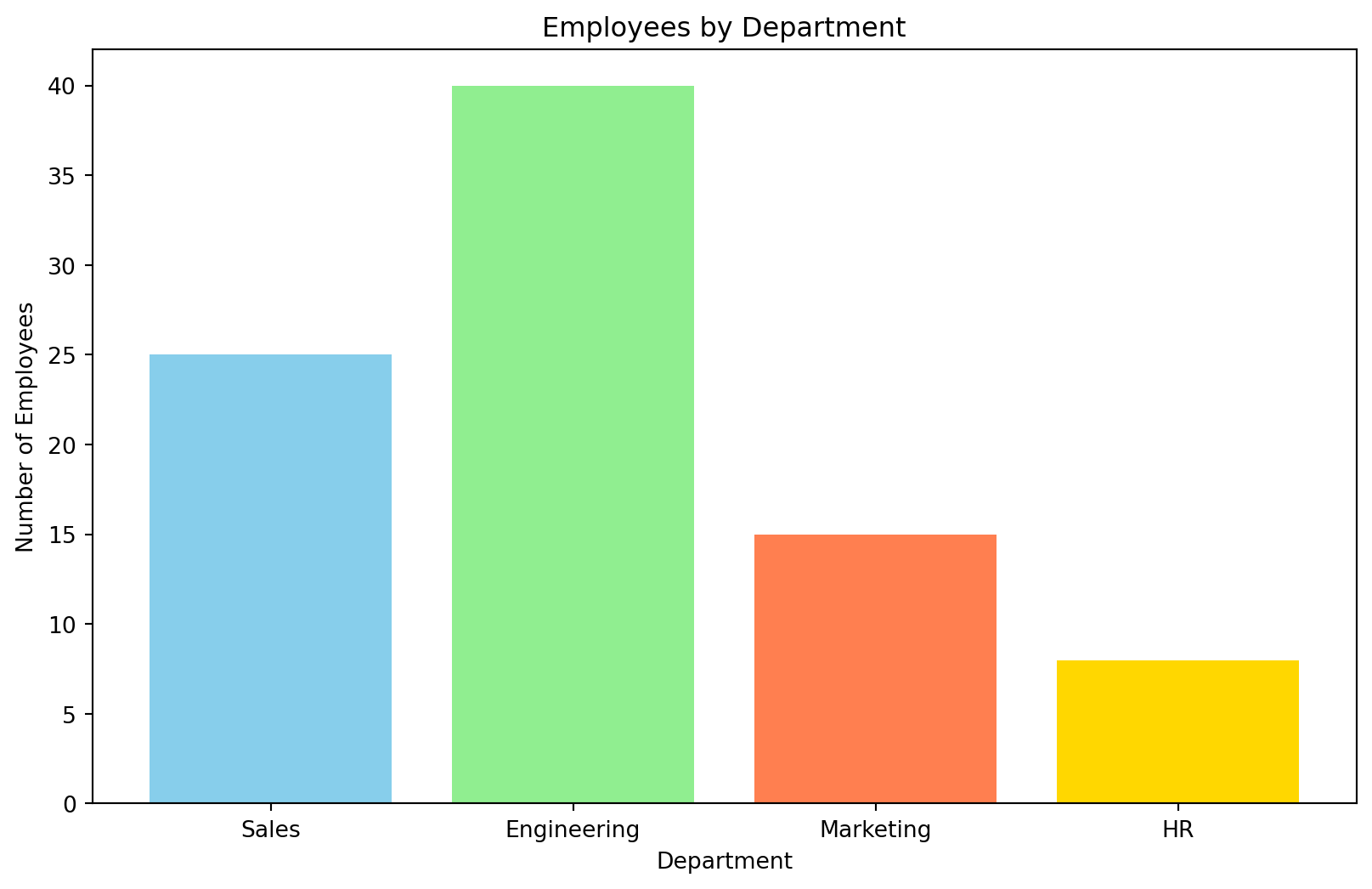
Scatter Plots
# Scatter plots show relationships between two variables
experience = [1, 2, 3, 4, 5, 6, 7, 8, 9, 10]
salary = [35000, 38000, 42000, 46000, 50000, 55000, 60000, 65000, 70000, 75000]

plt.figure(figsize=(10, 6))
plt.scatter(experience, salary, color='purple', alpha=0.7, s=100)
plt.title('Salary vs Years of Experience')
plt.xlabel('Years of Experience')
plt.ylabel('Salary ($)')
plt.show()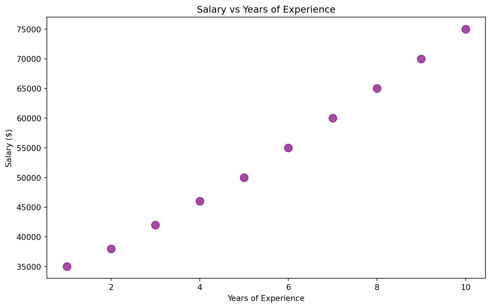
Histograms
# Histograms show the distribution of a single variable
np.random.seed(42)
test_scores = np.random.normal(78, 12, 100)

plt.figure(figsize=(10, 6))
plt.hist(test_scores, bins=15, color='lightblue', edgecolor='black', alpha=0.7)
plt.title('Distribution of Test Scores')
plt.xlabel('Test Score')
plt.ylabel('Number of Students')
plt.axvline(test_scores.mean(), color='red', linestyle='--', label=f'Mean: {test_scores.mean():.1f}')
plt.legend()
plt.show()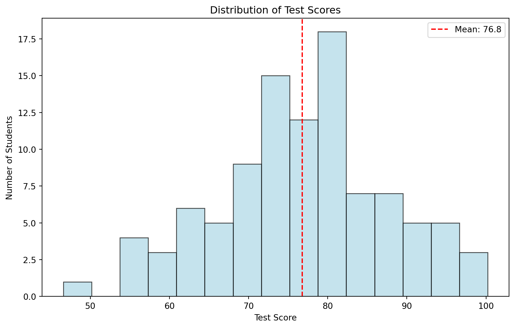
Object-Oriented Example
# Create sample data
data = {
    'Quarter': ['Q1', 'Q2', 'Q3', 'Q4'],
    'Revenue': [150000, 180000, 210000, 190000],
    'Profit': [30000, 40000, 50000, 40000]
}
df = pd.DataFrame(data)

# Create subplots
fig, (ax1, ax2) = plt.subplots(1, 2, figsize=(12, 4))

ax1.bar(df['Quarter'], df['Revenue'], color='steelblue')
ax1.set_title('Revenue by Quarter')
ax1.set_ylabel('Revenue ($)')

ax2.plot(df['Quarter'], df['Profit'], marker='o', color='green')
ax2.set_title('Profit Trend')
ax2.set_ylabel('Profit ($)')

plt.tight_layout()
plt.show()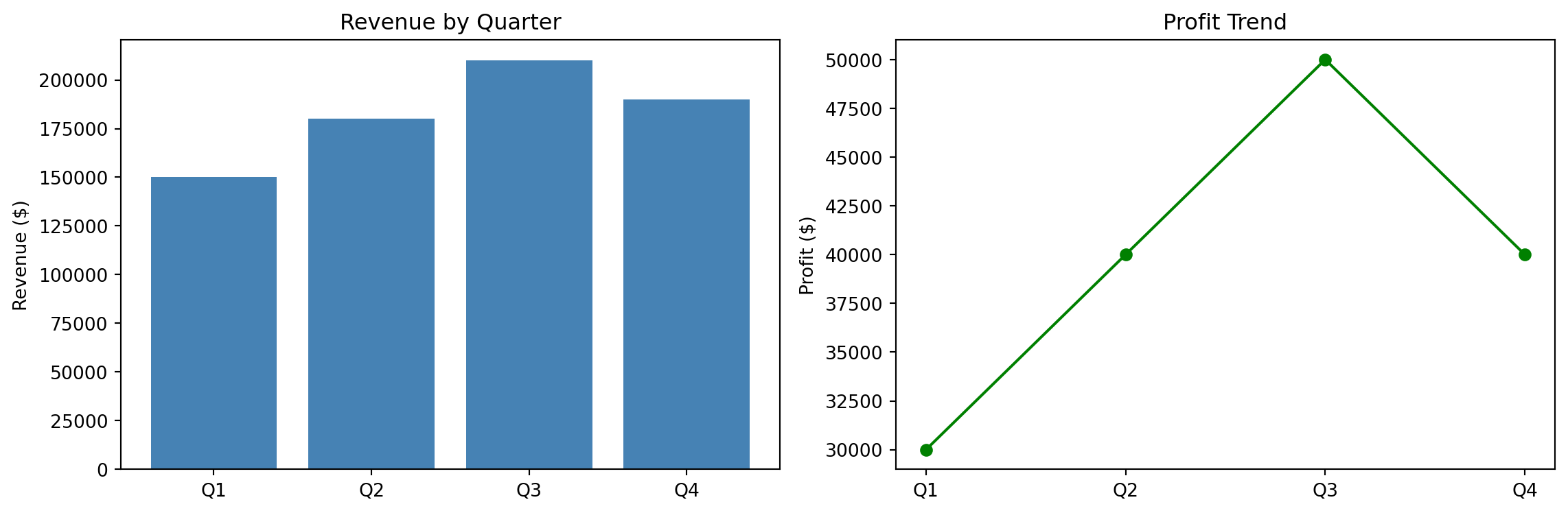
Whitegrid Theme
sns.set_theme(style="whitegrid")

plt.figure(figsize=(10, 6))
plt.scatter(performance_data['marketing_spend'], performance_data['revenue'],
           alpha=0.7, s=60, color='steelblue')
plt.title("Whitegrid Theme", fontsize=16, fontweight='bold')
plt.xlabel('Marketing Spend ($)')
plt.ylabel('Revenue ($)')
plt.tight_layout()
plt.show()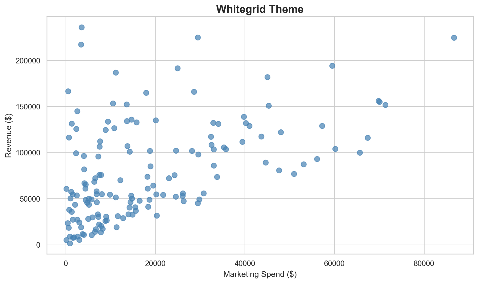
Darkgrid Theme
sns.set_theme(style="darkgrid")

plt.figure(figsize=(10, 6))
plt.scatter(performance_data['marketing_spend'], performance_data['revenue'],
           alpha=0.7, s=60, color='lightcoral')
plt.title("Darkgrid Theme", fontsize=16, fontweight='bold')
plt.xlabel('Marketing Spend ($)')
plt.ylabel('Revenue ($)')
plt.tight_layout()
plt.show()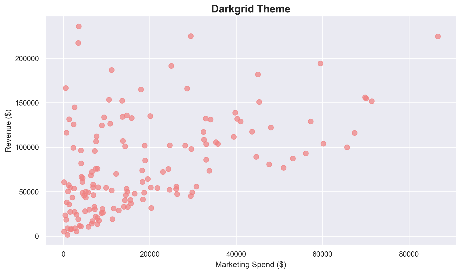
Custom Matplotlib Styling
plt.rcdefaults()
fig, ax = plt.subplots(figsize=(10, 6))

ax.set_facecolor('#f8f9fa')
fig.patch.set_facecolor('white')

ax.scatter(performance_data['marketing_spend'], performance_data['revenue'],
          alpha=0.7, s=60, color='#2E86C1', edgecolors='white', linewidth=0.5)

ax.set_title('Professional Custom Styling', fontsize=16, fontweight='bold', pad=20)
ax.set_xlabel('Marketing Spend ($)', fontsize=12)
ax.set_ylabel('Revenue ($)', fontsize=12)
ax.grid(True, color='white', linewidth=1.5, alpha=0.8)

plt.tight_layout()
plt.show()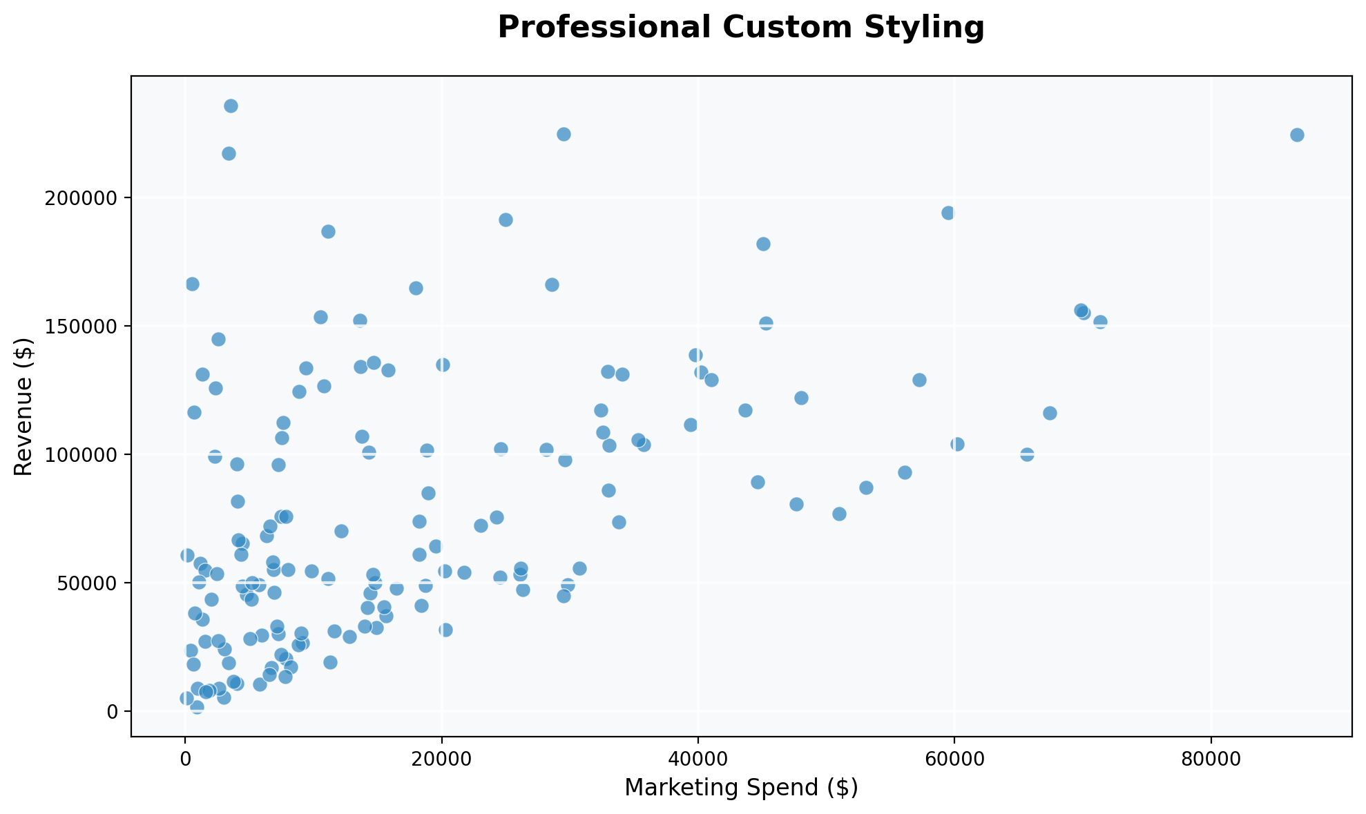
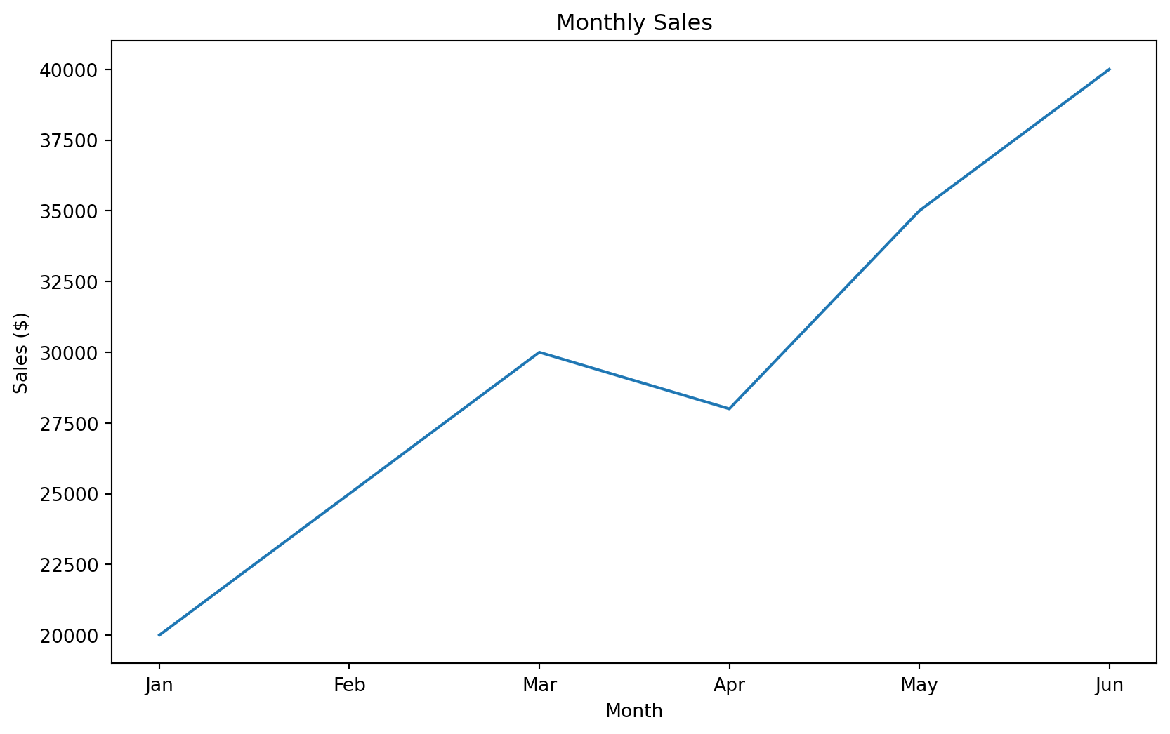
Setting Global Font Sizes
plt.rc('font', size=14)
plt.rc('axes', titlesize=18)
plt.rc('axes', labelsize=16)
plt.rc('xtick', labelsize=12)
plt.rc('ytick', labelsize=12)
plt.rc('legend', fontsize=14)

# Example with larger fonts
months = ['Jan', 'Feb', 'Mar', 'Apr', 'May', 'Jun']
sales = [120, 135, 148, 162, 155, 170]

plt.figure(figsize=(10, 6))
plt.plot(months, sales, marker='o', linewidth=3, color='navy')
plt.title('Monthly Sales Growth')
plt.xlabel('Month')
plt.ylabel('Sales (thousands)')
plt.grid(True, alpha=0.3)
plt.show()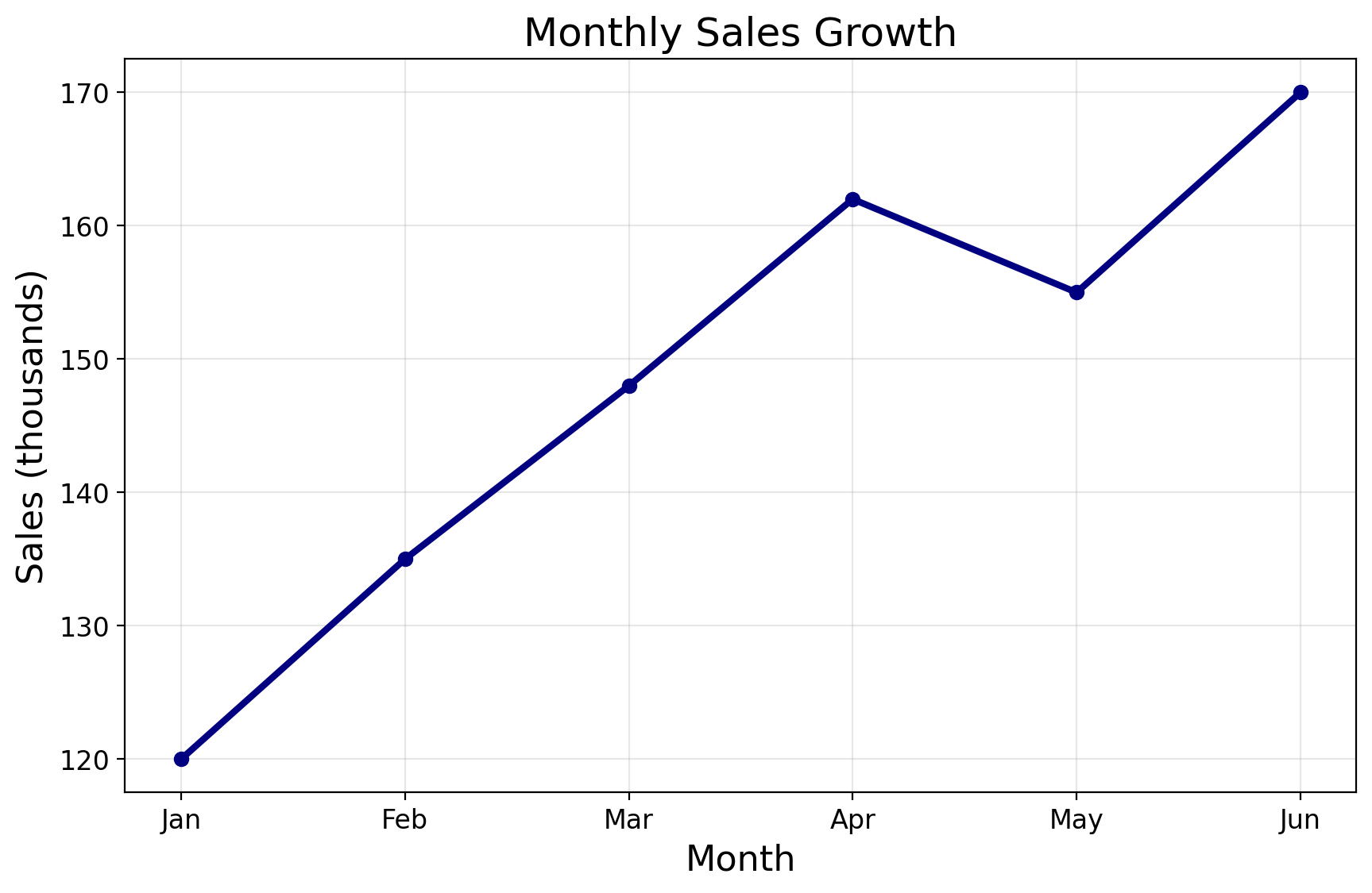
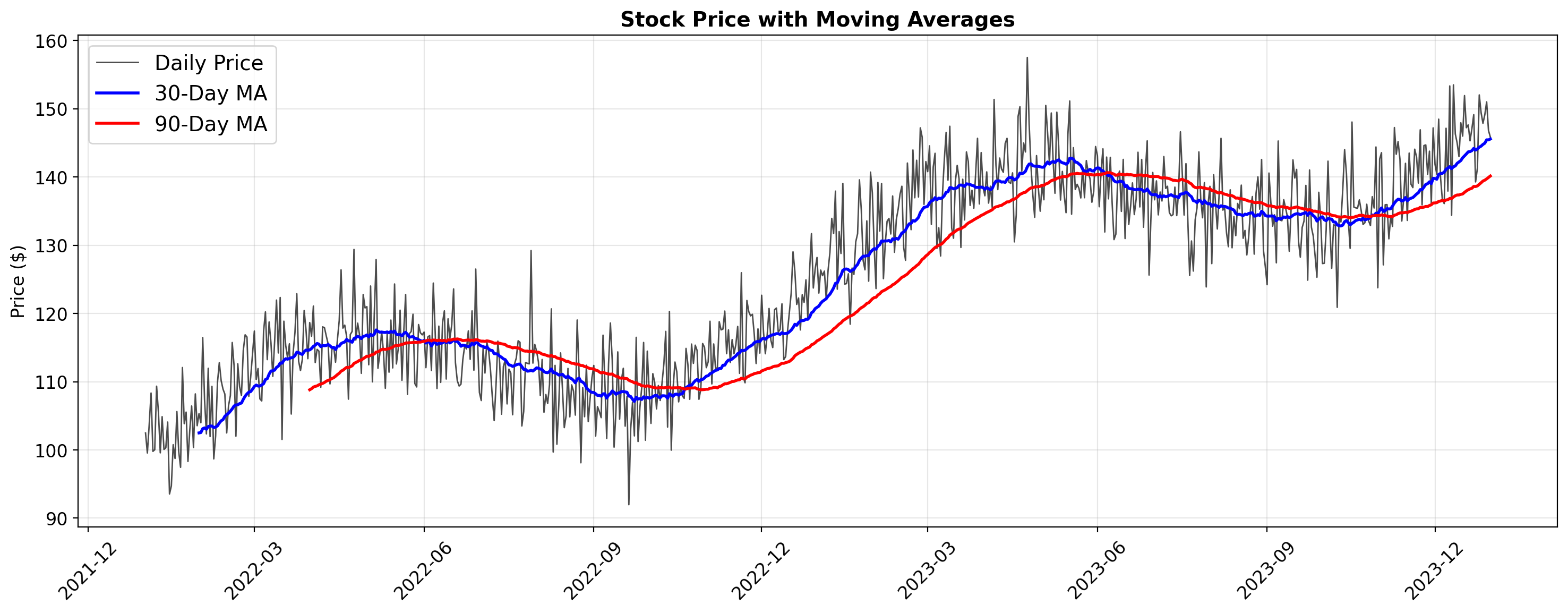
Time Series Visualization
fig, ax = plt.subplots(figsize=(15, 6))

ax.plot(stock_data['date'], stock_data['price'], alpha=0.7, linewidth=1,
        label='Daily Price', color='black')
ax.plot(stock_data['date'], stock_data['ma_30'], linewidth=2,
        label='30-Day MA', color='blue')
ax.plot(stock_data['date'], stock_data['ma_90'], linewidth=2,
        label='90-Day MA', color='red')

ax.set_title('Stock Price with Moving Averages', fontsize=14, fontweight='bold')
ax.set_ylabel('Price ($)', fontsize=12)
ax.legend()
ax.grid(True, alpha=0.3)

ax.xaxis.set_major_formatter(mdates.DateFormatter('%Y-%m'))
ax.xaxis.set_major_locator(mdates.MonthLocator(interval=3))
plt.setp(ax.xaxis.get_majorticklabels(), rotation=45)

plt.tight_layout()
plt.show()